Note
Go to the end to download the full example code.
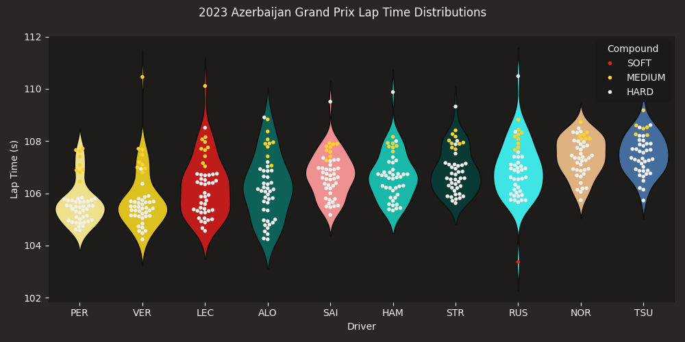
Driver Laptimes Distribution Visualization
Visualizae different drivers’ laptime distributions.
import seaborn as sns
from matplotlib import pyplot as plt

import fastf1
import fastf1.plotting


# enabling misc_mpl_mods will turn on minor grid lines that clutters the plot
fastf1.plotting.setup_mpl(mpl_timedelta_support=False, misc_mpl_mods=False)
Load the race session
race = fastf1.get_session(2023, "Azerbaijan", 'R')
race.load()
Get all the laps for the point finishers only. Filter out slow laps (yellow flag, VSC, pitstops etc.) as they distort the graph axis.
point_finishers = race.drivers[:10]
print(point_finishers)
driver_laps = race.laps.pick_drivers(point_finishers).pick_quicklaps()
driver_laps = driver_laps.reset_index()
['11', '1', '16', '14', '55', '44', '18', '63', '4', '22']
To plot the drivers by finishing order, we need to get their three-letter abbreviations in the finishing order.
finishing_order = [race.get_driver(i)["Abbreviation"] for i in point_finishers]
print(finishing_order)
['PER', 'VER', 'LEC', 'ALO', 'SAI', 'HAM', 'STR', 'RUS', 'NOR', 'TSU']
We need to modify the DRIVER_COLORS palette. Its keys are the driver’s full names but we need the keys to be the drivers’ three-letter abbreviations. We can do this with the DRIVER_TRANSLATE mapping.
driver_colors = {abv: fastf1.plotting.DRIVER_COLORS[driver] for abv,
                 driver in fastf1.plotting.DRIVER_TRANSLATE.items()}
print(driver_colors)
{'LEC': '#dc0000', 'SAI': '#ff8181', 'SHW': '#9c0000', 'VER': '#fcd700', 'PER': '#ffec7b', 'DEN': '#907400', 'PIA': '#ff8700', 'NOR': '#eeb370', 'OWA': '#ee6d3a', 'GAS': '#fe86bc', 'OCO': '#ff117c', 'DOO': '#894667', 'BOT': '#00e701', 'ZHO': '#008d01', 'POU': '#004601', 'DEV': '#1e3d61', 'TSU': '#356cac', 'RIC': '#2b4562', 'LAW': '#2b4562', 'HAD': '#1e6176', 'IWA': '#1e6176', 'MAG': '#ffffff', 'HUL': '#cacaca', 'BEA': '#c40000', 'ALO': '#006f62', 'STR': '#00413b', 'DRU': '#2f9b90', 'HAM': '#00d2be', 'RUS': '#24ffff', 'VES': '#00a6ff', 'ALB': '#005aff', 'SAR': '#012564', 'OSU': '#1b3d97'}
First create the violin plots to show the distributions. Then use the swarm plot to show the actual laptimes.
# create the figure
fig, ax = plt.subplots(figsize=(10, 5))

# Seaborn doesn't have proper timedelta support
# so we have to convert timedelta to float (in seconds)
driver_laps["LapTime(s)"] = driver_laps["LapTime"].dt.total_seconds()

sns.violinplot(data=driver_laps,
               x="Driver",
               y="LapTime(s)",
               hue="Driver",
               inner=None,
               density_norm="area",
               order=finishing_order,
               palette=driver_colors
               )

sns.swarmplot(data=driver_laps,
              x="Driver",
              y="LapTime(s)",
              order=finishing_order,
              hue="Compound",
              palette=fastf1.plotting.COMPOUND_COLORS,
              hue_order=["SOFT", "MEDIUM", "HARD"],
              linewidth=0,
              size=4,
              )
<Axes: xlabel='Driver', ylabel='LapTime(s)'>
Make the plot more aesthetic
ax.set_xlabel("Driver")
ax.set_ylabel("Lap Time (s)")
plt.suptitle("2023 Azerbaijan Grand Prix Lap Time Distributions")
sns.despine(left=True, bottom=True)

plt.tight_layout()
plt.show()
Total running time of the script: (0 minutes 3.659 seconds)