Note
Go to the end to download the full example code.
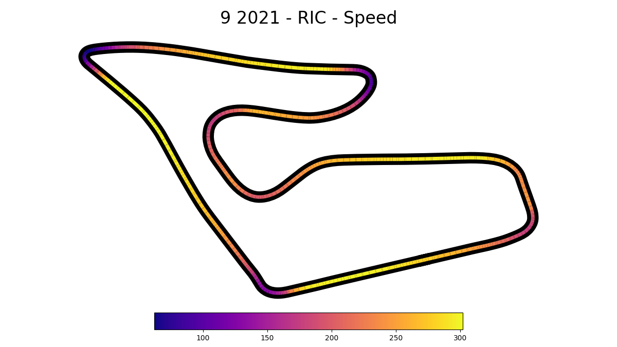
Speed visualization on track map
(Example provided by @JSEHV on Github)
import matplotlib as mpl
import numpy as np
from matplotlib import pyplot as plt
from matplotlib.collections import LineCollection

import fastf1 as ff1
First, we define some variables that allow us to conveniently control what we want to plot.
year = 2021
wknd = 9
ses = 'R'
driver = 'RIC'
colormap = mpl.cm.plasma
Next, we load the session and select the desired data.
session = ff1.get_session(year, wknd, ses)
weekend = session.event
session.load()
lap = session.laps.pick_driver(driver).pick_fastest()

# Get telemetry data
x = lap.telemetry['X']              # values for x-axis
y = lap.telemetry['Y']              # values for y-axis
color = lap.telemetry['Speed']      # value to base color gradient on
Now, we create a set of line segments so that we can color them individually. This creates the points as a N x 1 x 2 array so that we can stack points together easily to get the segments. The segments array for line collection needs to be (numlines) x (points per line) x 2 (for x and y)
points = np.array([x, y]).T.reshape(-1, 1, 2)
segments = np.concatenate([points[:-1], points[1:]], axis=1)
After this, we can actually plot the data.
# We create a plot with title and adjust some setting to make it look good.
fig, ax = plt.subplots(sharex=True, sharey=True, figsize=(12, 6.75))
fig.suptitle(f'{weekend.name} {year} - {driver} - Speed', size=24, y=0.97)

# Adjust margins and turn of axis
plt.subplots_adjust(left=0.1, right=0.9, top=0.9, bottom=0.12)
ax.axis('off')


# After this, we plot the data itself.
# Create background track line
ax.plot(lap.telemetry['X'], lap.telemetry['Y'],
        color='black', linestyle='-', linewidth=16, zorder=0)

# Create a continuous norm to map from data points to colors
norm = plt.Normalize(color.min(), color.max())
lc = LineCollection(segments, cmap=colormap, norm=norm,
                    linestyle='-', linewidth=5)

# Set the values used for colormapping
lc.set_array(color)

# Merge all line segments together
line = ax.add_collection(lc)


# Finally, we create a color bar as a legend.
cbaxes = fig.add_axes([0.25, 0.05, 0.5, 0.05])
normlegend = mpl.colors.Normalize(vmin=color.min(), vmax=color.max())
legend = mpl.colorbar.ColorbarBase(cbaxes, norm=normlegend, cmap=colormap,
                                   orientation="horizontal")


# Show the plot
plt.show()
Total running time of the script: (0 minutes 5.938 seconds)